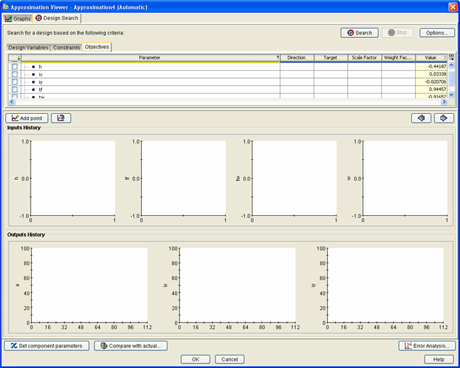
About Searching the Design Automatically | ||||
|
| |||
The following figure shows an example of the Design Search tab in the Design Gateway.
After you execute the search, Isight adds graphs to the Input History and Output History areas in the lower section of the Design Search tab or subtab.
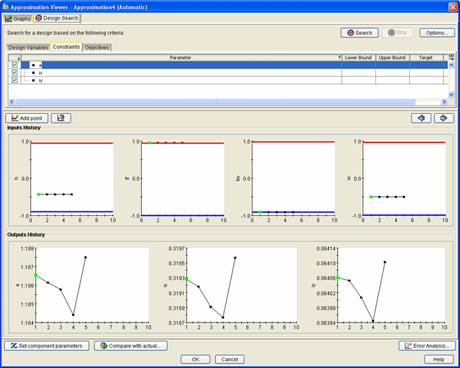
The graphs are color coded and show bounds (if the bounds are within the sampling range):
-
Black represents a feasible design point.
-
Red represents an infeasible design point.
-
Green represents the best design point (based on the calculated objective). This point is always a feasible point (i.e., no violated constraints).
-
Yellow represents the best design point, but a point that is infeasible. Yellow appears when there is at least one objective defined and either there are no feasible points found or the best feasible point (green) has a worse calculated objective and penalty. In this case, this point might be a better design even though it is slightly infeasible.