About Correlation Tables | ||
| ||
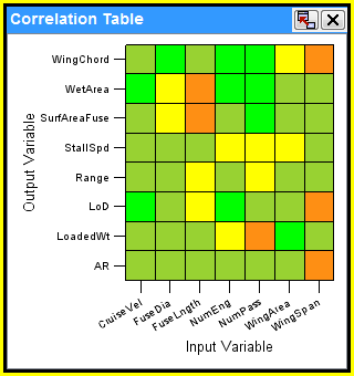
The following figure shows an example of a correlation table:
Note: For this example, an in/out parameter is used as the input parameter.

The correlation table uses shades of blue, green, yellow, and red to indicate the relationship between parameters. The greater the absolute value of a correlation coefficient, the stronger the relationship is between the parameters. The strongest relationship is indicated by a correlation coefficient of –1 or 1, and the patch is shaded dark blue (–1), dark red(1) red. The weakest relationship is indicated by a correlation coefficient of 0, and the patch is shaded green. Coefficient values between 0 and –1 or 1 are shaded a continuum of blue to green to yellow to red.
You can select to view Rank or Linear correlation values. For more information about rank or linear correlation values, see Correlation Map Reference Information.